01 / Challenge
Show the belief
“Thinking outside the box” is easy to write and nearly impossible to prove with a conventional studio template. B&E needed a website that could showcase the work while committing to the ideas behind it.
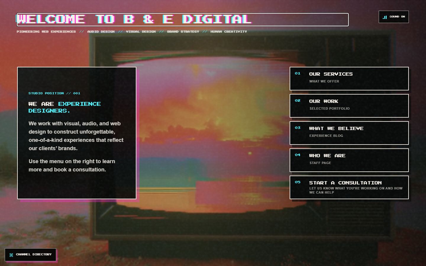
The answer was to make the studio site part portfolio, part transmission system, part essay, and part installation art. The argument for experience design happens through participation.
The studio website is itself one of the studio’s projects.
02 / System
A portfolio with a point of view
The experience uses a threshold entrance, broadcast language, a recursive portfolio, a rotary telephone, a false operating system, an interactive field guide, and a hand-cranked cinematic crawl. Humor, sound, interaction, and technical structure all carry the same position: digital work can feel authored.
These moments are not detached experiments. They demonstrate the kinds of thinking B&E brings to client work—finding an interaction model that belongs to the idea instead of decorating a generic page after the fact.
03 / Navigation
Exploration without compulsory wandering
The original journey rewarded visitors who moved through the studio one transmission at a time, but it made deliberate return visits harder. The finished system keeps the entrance and discovery while adding direct channel URLs, browser-history support, a persistent directory, and a human-readable site map.
A visitor can now enter theatrically, jump directly to the work, share the consultation channel, or return through browser Back without the site forgetting where they were. Being mysterious does not require being directionless.
04 / Commitments
What the site commits to
- Websites should feel like places.
- Distinctive ideas should be preserved, not sanded down into generic professionalism.
- Creators should own their work, their platform, and their relationship with their audience whenever possible.
- Usefulness and experimentation are not opposites.
05 / Mechanics
The interface carries the argument
The rotary-phone piece asks visitors to place a call. The false operating system treats the browser as a doorway. The cinematic crawl is operated by a manual window crank: turning normally keeps the score stable, stopping lets it wind down, and reversing makes the transmission run backward.
Those mechanics are jokes with structural jobs. They turn abstract claims about friction, memory, and participation into something the visitor physically understands.
06 / Engineering
Spectacle with guardrails
The site supports keyboard interaction, reduced-motion preferences, responsive layouts, visible focus states, semantic headings, and descriptive media labels. Sound begins through deliberate interaction rather than surprise autoplay.
Live portfolio previews remain completely disconnected while offscreen. When a monitor enters the viewport, its iframe receives a source and tunes through animated static while loading. The recursive B&E preview also has a hard nesting guard, preventing the joke from becoming an infinite browser incident.
07 / Practice
Strange can still work beautifully
A site can be weird, funny, theatrical, interactive, or deeply authored and still be legible, responsive, maintainable, and useful. Beneath the spectacle is a practical principle: make creative work easier to produce, manage, present, and keep alive.
That principle connects the studio’s archives, CMS systems, brand foundations, production tools, and experimental interfaces. The aesthetic changes; the commitment to giving ideas an appropriate structure does not.
08 / Credits
Who made it
Azakaela Erin Redfire — creative direction, design, development, writing, and experience design.
Brooke C. Benson — co-owner, brand direction, and visual consultation.
@ryantube112 — contributed photography. Find them on Discord and Instagram.
Next transmission
Want a site people remember?
Your project does not need to look like this one. It needs an interaction, structure, and atmosphere that could only belong to it.