Let me begin with a little professional restraint:
I made Glenn C. Hahn’s website, and it fucking rules.
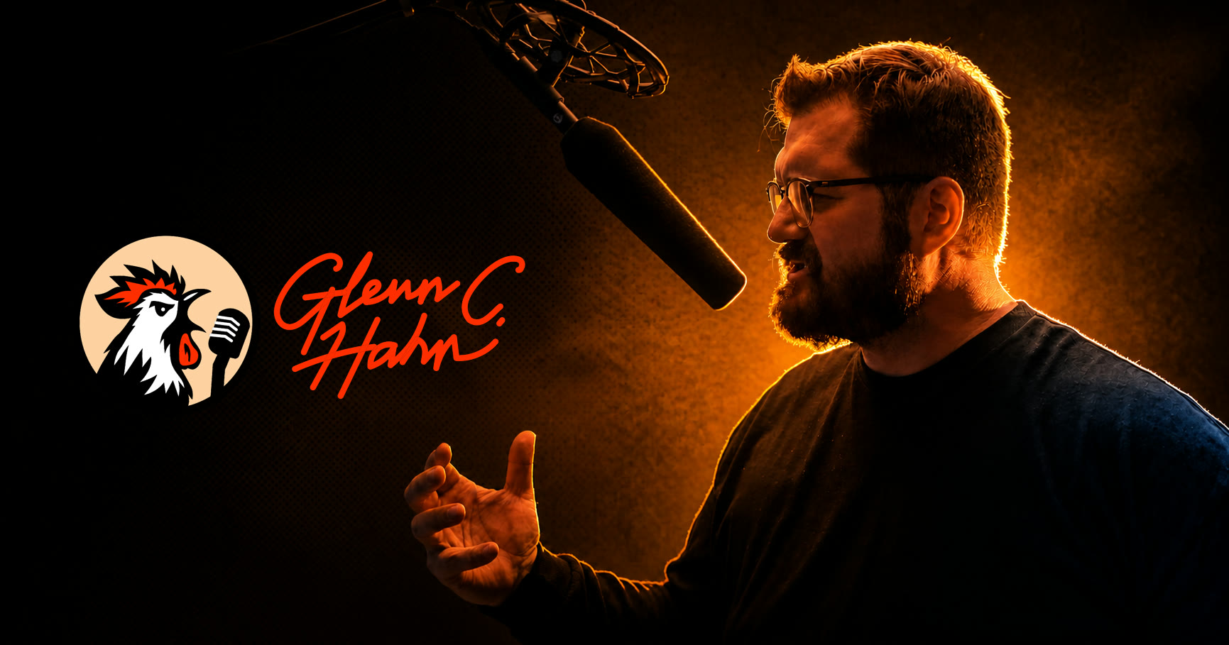
I am not saying that because it moves. I am not saying it because there is custom artwork, dramatic studio photography, playable audio, a comic-book opening, or a rooster holding a microphone.
Those things are all cool. I am very pleased with them. The rooster is excellent.
But the thing I am actually proud of is that the site understands Glenn before it tries to advertise him.
The assignment was never:
Put a demo reel on the internet.
The assignment was:
Make one human being’s entire creative range feel coherent.
Glenn is a voice actor. He is also a writer, producer, storyteller, game master, and creative collaborator. Those are not six unrelated items to throw into a navigation bar and hope somebody reads. They are six expressions of the same brain.
A normal performer template would have reduced that brain to a headshot, a play button, and a contact form.
I did not make a normal performer template.
In fact, the first iteration looked like a comic.
Not “comic-inspired.” Not “cinematic storytelling with sequential-art influence.”
A comic.
Then I looked at it and went:
“Oh.
I forgot to make it actually a website.”
Which is a very me problem to have.
The good news is that the comic was not wasted work. It had already found the visual language, pacing, attitude, and theatrical entrance. The next move was to build the professional structure underneath it: real navigation, clear listening paths, readable writing, useful services, proof, ownership, and a contact experience that could carry an actual project.
I built an authored professional home where somebody can understand the person, hear the work, read the writing, inspect the range, and send a real project brief without being kicked out of the experience.
That distinction matters.
The portfolio needed to sound like Glenn
before anyone pressed play.
Brooke made the logo: a rooster and microphone fused into this sharp little broadcast mark. It is clever, recognizable, and exactly weird enough. I get to brag about that too because Brooke is part of B&E, collaboration counts, and the logo absolutely rules.
From there, Signal Orange became the vibe.
Signal Orange escaped the brand guide and became a transmission: hot against black, warm inside the studio photography, bright enough to direct attention, and just dirty enough to belong beside pulp ink and recording-room ephemera.
We used tools we had already built to develop the color system, living colors, and animated gradients. That let the palette move without becoming generic rainbow sludge. The color could breathe, flare, and shift while still remaining unmistakably Glenn.
Then I layered in a very tasteful pulp paper texture.
Very tasteful.
The texture gives the digital surfaces a little physical history. It makes the site feel printed, handled, recorded, and passed around without turning every section into a novelty prop.
The opening is an interactive comic sequence. It introduces his roles through story, portraiture, and motion. It has pacing. It has a point of view. It also has a skip control, because a good experience knows the difference between inviting someone into a mood and holding their work hostage.
That is one of those decisions I love because it is both theatrical and practical.
Awww man
it’s awesomemmeeee!
Then there is the listening system.
Instead of dumping every recording into one sad little audio list, the featured demo gets an actual stage. The broader library separates character, narration, audiobook, and commercial work. Individual samples can carry a role description, vocal range, and purpose so a director is not forced to reverse-engineer what they are hearing.
Somebody can get the immediate impression and then investigate the exact kind of read they need.
That is design doing a job.
The writing does not get shoved beneath an “Other Skills” heading either. It receives a dedicated carousel with substantial, readable excerpts presented in a paper-textured frame. Storytelling, production, and consultation have their own space. Testimonials and journal posts add evidence and context instead of functioning as decorative praise confetti.
The professional argument becomes much stronger:
You can hire Glenn to read finished material or bring him in earlier to help find the character, logic, tone, and story.
I did the strategy.
I did the identity system.
I did the art direction, writing, design, development, CMS architecture, and production launch.
Yes. I am bragging.
Glenn brought the performance, source material, creative collaboration, and final approval. My job was to build the system that could carry all of it without flattening him.
I also built the part people love to pretend is not design: ownership.
Glenn has a private custom content system where he can control site copy, testimonials, writing samples, credits, voice samples, featured demos, contact settings, and journal posts. He can publish, hide, reorder, and revise the work without asking a developer to rebuild his professional life every time something changes.
The public site can evolve while the authored design stays authored.
That sounds obvious until you look at how many “custom” websites either trap the owner inside a developer relationship or collapse into a generic page builder the moment the content moves.
I wanted neither.
And then I did the invisible grown-up work.
The site has responsive layouts, keyboard-visible controls, semantic landmarks, and reduced-motion support. It has direct project-inquiry delivery with a fallback. It has descriptive metadata, canonical URLs, social-preview artwork, structured data, a crawlable sitemap, and rules that keep private management surfaces out of public indexing.
The beautiful artifact also works as a piece of professional infrastructure.
That is the brag.
Not that I found one clever visual trick.
Not that I made a page look expensive.
I held identity, storytelling, usability, ownership, accessibility, discoverability, and business function in the same system without sanding Glenn down into Generic Creative Man Number Four.
And no, I do not need to give away secrets to prove any of this.
I am not publishing private client conversations, source code, credentials, hidden infrastructure, unpublished analytics, or the exact machinery behind the effects. The work is public. The client relationship is not content. Professional discretion is part of doing the job well.
What I can show you is the result.
You can see the identity. You can use the interface. You can hear the work. You can read the writing. You can inspect the structure. You can watch the site remain unmistakably Glenn while still behaving like a serious business tool.
That is enough evidence for me to say it again:
It is polished enough to do business and specific enough to be remembered.
If you want to see the actual work, visit Glenn’s live site. If you want the polite professional version of everything I just yelled, read the B&E case study.
I contain multitudes.
One of them is extremely proud of this website.